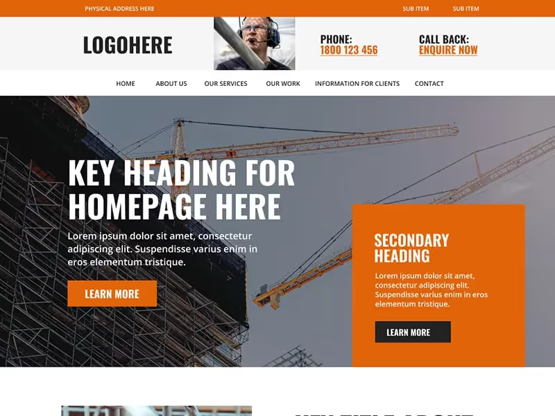
Overall, we think builders and those in the construction can benefit from a strong image focus on their website - however this is often at the expense for text, which is important from a search engine optimisation (SEO) point of view.
One of the key features we believe is important in creating a website design for builders and construction companies are the dedicated sub-page for the service.
This enables visitors to deeper into some of the specifics regarding each service, however also helps with SEO as you're able to use targeted keywords and locations through out the content (i.e. Bathroom Renovation Builders Australia).
An 'information for clients' area, coupled with a frequently asked questions section, can also help break down barriers for visitors and could be a point of difference between yourself and the competition.
Homepage
About
- About Us
- Our People
Services/What We Do
- 3-5 Sub Pages For Each Service
Information For Clients
Our Projects
- Sub page for each project
Contact
Enquire Now
Optional pages: Education Hub/Blog, Video Resources, FAQ
Social media links
Contact form
Enquiry form (specific fields)
Project Area and Gallery - CMS
After browsing your website, users of a builder or construction style website will want to make contact and this should be easy to do.
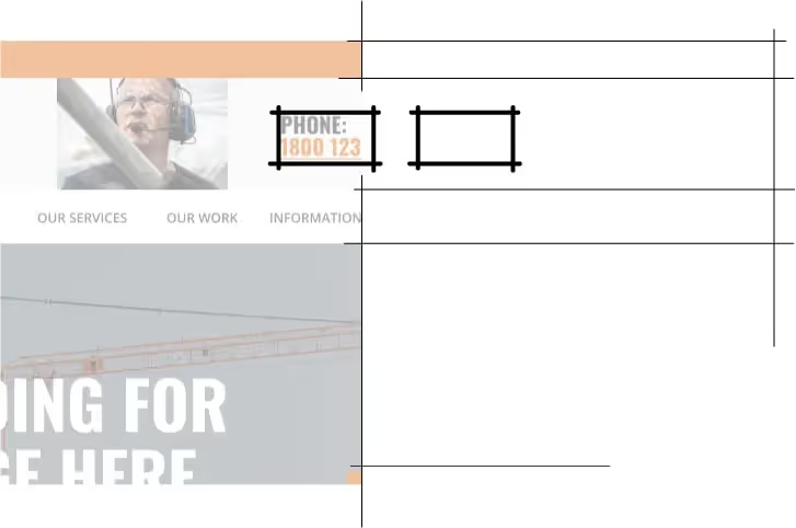
One way to achieve this is this by implementing key contact information (i.e. a phone number or link to form) into an area such as the website menu, which we always have on every page.
A photo can also make the contact personable, as the visitor can visualise who it is they are talking to.
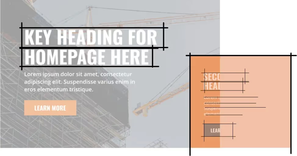
Websites for builders in particular can benefit from bold headings (in terms of weight and font) and colours, however these should match your branding.
Think about using the bright colour for call to actions - such as buttons or clickable areas - as the visitor eye will be drawn to these.
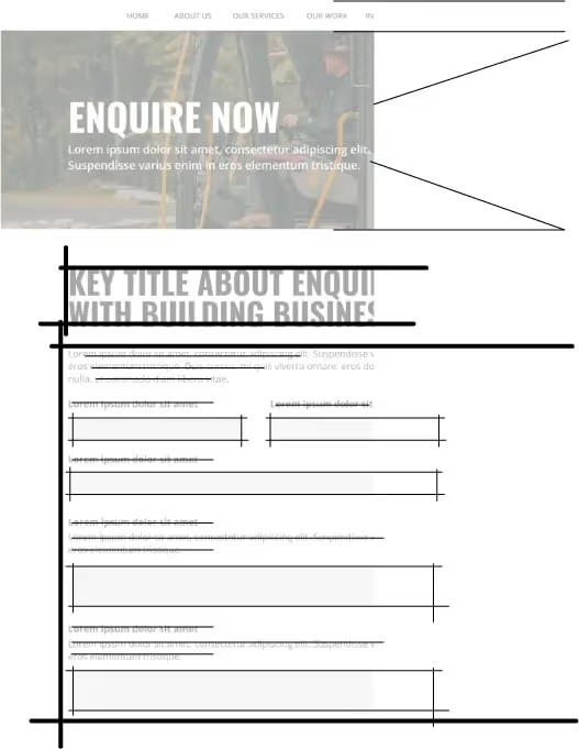
Having a specific page and form for enquiries, as opposed to just contact, is a great way to filter out genuine visitors and also collect more information relevant to each project.
This can help reduce some of the logistics and headache with regard to clarifying budget, timeframes and requirements - as these can all be collected in the enquiry form.
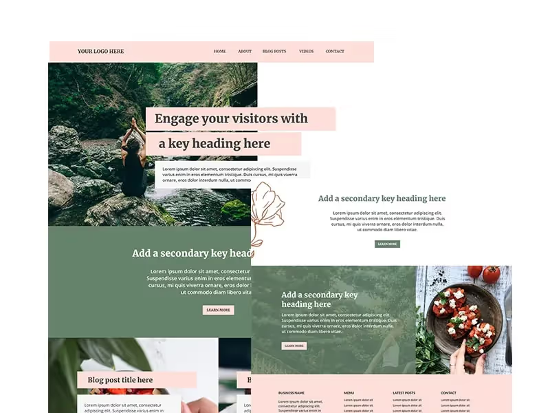
This 'earth' website template is perfect for blogger and influencers looking to stand out online.
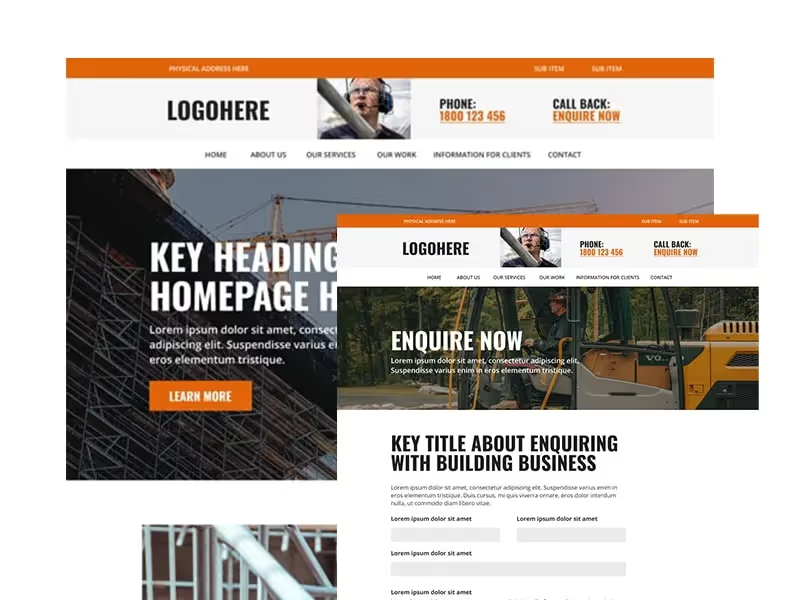
With strong headings and a bold colour scheme, our builder and architect website is perfect for those looking for a professional website.